How Semantic HTML Landmarks Improve Accessibility
Screen readers typically have to navigate a lot of structural fog, but with landmarks they'll see clear skies
Overview
Semantic HTML isn’t just about cleaner code — it creates landmarks that make websites more accessible and easier to navigate, especially for screen reader users.
Tags like <header>, <footer>, <main>, etc act like <div>s in many ways, and you may have wondered if there is really that much of a difference between <header> and <div id="header">. Surely <header> is just a little syntactic sugar that makes parsing code a little bit easier for the developer, right?
Using semantic HTML landmarks does indeed make parsing code regions easier, but the difference is bigger than just aesthetics. There is another purpose at play: improved screen reader user experience for navigation.
Why Semantic HTML Landmarks Matter
It’s easy to assume that a screen reader will just read a page top to bottom. While that is certainly one way to get through a page, the reality is that screen readers give their users multiple ways to jump through a page quickly. Some examples include jumping between headings, links, and (you guessed it) landmarks.
Landmarks for screen readers are not so different from those in the real world. When wandering Toronto, you can often see the CN Tower somewhere on the skyline, helping orient you in your position within the city.
However if a heavy fog falls in the city, or a particular pesky group of skyscrapers obstructs your view of the CN Tower, you may become a bit disoriented.
The same is true of screen reader landmarks. <header> acts like the CN Tower, helping screen readers convey its purpose and their position on the page. <div id="header"> covers things in fog, making it harder to orient.
Semantic HTML Example: Adding Landmarks
Without landmarks
Let’s assume we have a basic HTML pseudo structure:
<div id="header">
  <a href="/">Logo</a>
  <ul> … </ul>
</div>
<div id="main">
  <h2>My article</h2>
  <p> … </p>
  <h2>Related content</h2>
  <ul> … </ul>
</div>
<div id="footer">
  <ul> … </ul>
</div>
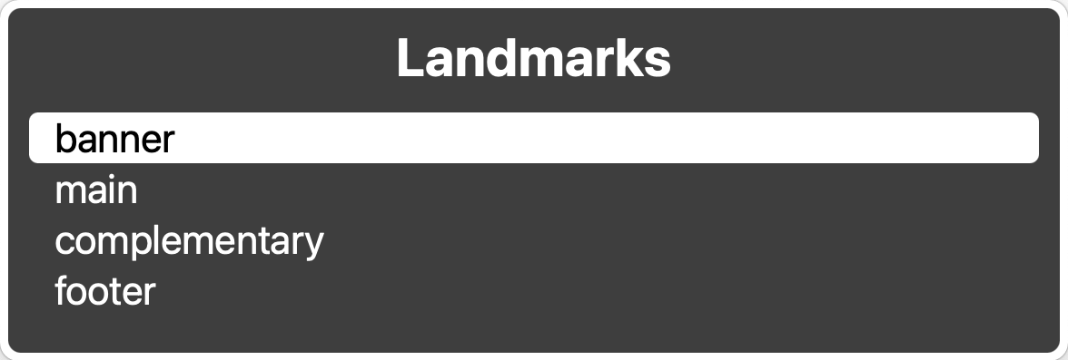
As it stands now, this page is comprised of:
- A header with a logo and navigation links
- A main content area
- A footer with navigation links
Despite this structure, there are no landmarks present for a screen reader to parse through.
With landmarks
The great thing is, we can make small alterations to this existing code to reveal some landmarks to a screen reader. Let’s swap out the generic <div>s for their more semantic equivalents, like <header>, <main>, <aside>, and <footer>.
<header>
  <a href="/">Logo</a>
  <ul> … </ul>
</header>
<main>
  <div>
    <h2>My article</h2>
    <p> … </p>
  </div>
  <aside>
    <h2>Related content</h2>
    <ul> … </ul>
  </aside>
</main>
<footer>
  <ul> … </ul>
</footer>
And just like that, we have 4 landmarks revealed to screen readers! Users with accessibility needs now have a better idea of how to navigate the city they’ve found themselves in. With a few more small improvements, we can make this code a fully fledged city map.
Enhancing Landmarks with <nav> and ARIA
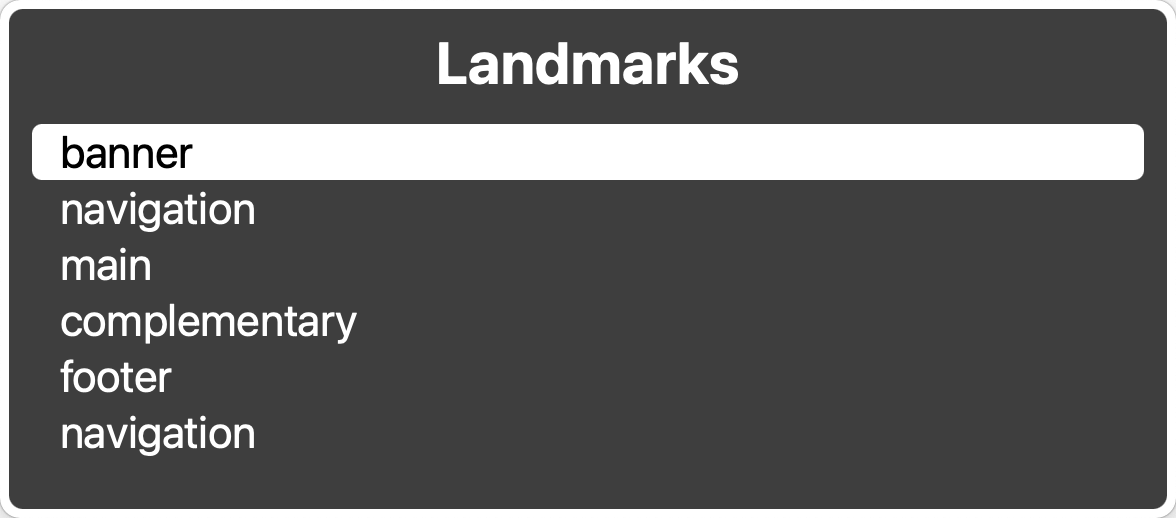
We can take things one step further by adding in navigation tags around the list of navigation links within the <header> and <footer>.
<header>
  <a href="/">Logo</a>
  <nav>
    <ul> … </ul>
  </nav>
</header>
<main>
  <div>
    <h2>My article</h2>
    <p> … </p>
  </div>
  <aside>
    <h2>Related content</h2>
    <ul> … </ul>
  </aside>
</main>
<footer>
  <nav>
    <ul> … </ul>
  </nav>
</footer>
This will reveal two more landmarks to our screen readers. However, while they are listed as navigation landmarks, they don’t specify what kind of navigation they contain. Right now there’s not much telling our users which navigation landmark is the CN Tower, and which one is the Seattle Space Needle - at a glance they look the same.
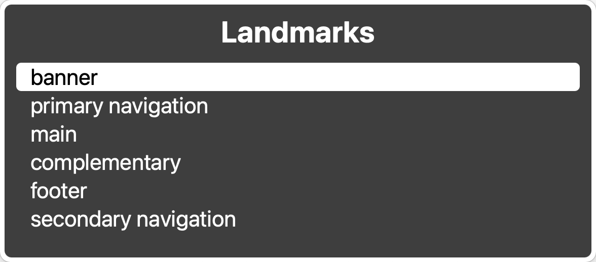
We can address this by adding aria-label attributes on the <nav> tags.
<header>
  <a href="/">Logo</a>
  <nav aria-label="primary">
    <ul> … </ul>
  </nav>
</header>
<main>
  <div>
    <h2>My article</h2>
    <p> … </p>
  </div>
  <aside>
    <h2>Related content</h2>
    <ul> … </ul>
  </aside>
</main>
<footer>
  <nav aria-label="secondary">
    <ul> … </ul>
  </nav>
</footer>
With the use of ARIA, these landmarks will now be announced as “Primary Navigation” and “Secondary Navigation” to our screen readers, and it will give our users more context as to which iconic free-standing structure they are looking at.
Wrap up
By swapping a few <div>s for semantic elements and adding clear labels where needed, we’ve turned a foggy skyline into a city map that anyone can navigate. What once looked like just “syntactic sugar” now stands tall as recognizable landmarks for screen readers, giving users the same confidence as a traveler who can always spot the CN Tower on the horizon.
Semantic HTML isn’t about writing fancier code — it’s about building a web that’s easier to explore, both for developers and for the people who rely on assistive technology every day. And the best part? It usually only takes a handful of small changes to make a page more welcoming to everyone.
So next time you’re laying out a page, think about the semantic HTML landmarks you’re creating. A <header>, a <main>, a <nav> — each one helps your visitors orient themselves. And just like in any great city, clear landmarks make the journey smoother, faster, and a whole lot less confusing.